Five Stages of Technology Sophistication

Much has been said about the transformative effect that technology (to be more precise, computer software) has had on various industries. But the effect is not new; nor is the transformation anywhere close to being complete. Looking across industries, we can notice themes. Specifically, as industries evolve, while the degree to which they utilize technology at a particular moment in time varies (for example, today marketing has at its disposal a much more sophisticated set of tools and technology practices than mortgages do) they seemed to embrace technology along the same predefined path. I've isolated five distinct stages, described below.

Stage One: Pre-technology

Industries usually begin as human endeavors. There are, of course, exceptions, most notably industries that were made possible in large part thanks to technology (such as bioengineering), but even today, surrounded by the abundance of tools and services that make it easy (so to speak) for the masses to technologize their efforts, we are fundamentally, as a species, not technology-literate the way we are capable of speaking or writing. Walk into any household or a company. Technology is relegated to technology-builders, and everyone else does everything but. And true, there are pockets where these proportions are out of whack, but even a technically-sophisticated companies like Google boast an order more non-technology than technology solutions.

On one hand, this is not surprising. Technology–and especially software–is very different from other human-adopted systems, and one of its biggest strengths is, in my view, also the reason why it's so hard for everyone to adopt. It's just so damn precise. There is very little if at all redundancy built in. Computer programs are recipes that are rigid like rail lines–they very explicitly move state from A to B under very specific conditions. Computer languages are compact (only a handful of keywords) and highly grammatical; but expressiveness suffers. Try replacing one character in your Ruby or Java code and your program will likely not compile. This means that to be truly technology literate, one has to have a rather seriously mathematical and systematic mind, capable of not just creating abstract representations of objects (which every brain does all the time, quietly) but also able to describe these representations very explicitly. This is why attempts to make programming "user-friendly" by using graphical diagramming-type metaphors or WYSIWYG controls always falls short of expectations.

On the other hand, I can't imagine this state of things persisting much longer (in a grander scale of things... say a century or so). But that's a topic of conversation for another time.

Stage Two: Local technology

As industries focus on systematization and cost-cutting, technology is usually brought in. This takes a very specific shape: I call it local technology to denote solutions that usually help individuals, or at most solve very small, specific problems. Part of why local technology is the earliest stage in such an evolution is historical: computers were only connected in the early 80s, while software existed much before then. But local technology is easier to get one's head around, and, most importantly, it doesn't violate interfaces: as a worked in company X, with local technology, your inputs and outputs didn't change; you still interacted with the same people and had the same responsibilities. Technology simply made you more efficient.

My recently favorite industry, mortgages and mortgage origination, illustrates this stage perfectly well. The complexity of the use cases (the completion of a mortgage application file) quickly outgrew human processes and the systematization took advantage of technology of the 80s, which was local technology. Each of the "stations" in the backend – loan officers, processors, underwriters – optimized their environment, but the interface remained because technology couldn't strongly connect the stations. The industry became deeply entrenched with this form of technology, so much so that it's only relatively recently that we're beginning to see a transformation from heavily optimized individual stations to optimized systems that include all stations (and perhaps redefine the stations altogether).

Stage Three: Connected technology

Easily the most exciting and enabling stage in the evolution of any industry. Of course, we are now living in the Renaissance of Connectedness: not a day goes by without me learning about a new problem space being "disrupted" by technology, which really just means a company successfully innovating on a business model to take advantage of the existence of the omnipresent and all-so-connecting Internet. That's exactly what Uber, Airbnb, Facebook, Twitter, Dropbox, Spotify, and dozens of other large private tech companies (can we really call them startups anymore?) are doing. Late 1990s saw a flurry of activity, but the environment wasn't quite ripe for true connectedness (made possible with near-universal broadband and then mobile data). Truly connected technology had to wait for mid-to-late 2000s and there's still a lot to connect.

Stage Four: Analysis and insight

The connecting power of technology simply cannot be underestimated. It will continue its run until the majority of industries are shaken up and redefined by the notion of connectedness. But the value of technology doesn't end here. Most industries, once connected, then turn to data and to the understanding of what's behind the data. Except in limited cases, analytics and insight only become tremendously more useful once the data from all connected endpoints are pooled and analyzed. That's a big idea behind the somewhat hype'y term Big Data.

Analysis and insight are a frontier beyond just connectedness. In search for further efficiency, industries must begin to understand the processes they put in place (via local technology) and connected (via connected technology). And while we hear a lot of companies whose competitive edge lies in analytics, the aforementioned Big Data slogan just won't die, Data Scientists are now the most sought-after professionals, we are only at the very beginning of useful analytics.

Stage Five: Artificial Intelligence

No matter how sophisticated, analytics is just as good as the heuristics that humans can think of or the trends that naturally emerge. In a quest for insight beyond that, we turn to technology's ultimate promise: one of emulating human intelligence. While there are a handful of companies that can boast truly artificially intelligent systems (some that come to mind are IBM, Google's computers hidden deep in the company's basements somewhere and processing facts under Peter Norvig's careful watch and perhaps Tesla), the solution space is nowhere near as "toolified": local technology has applications going back to early computers, connected technology has the Web, analysis and insight has machine learning and data visualization, but Artificial Intelligence is really mostly kept in the realm of research papers and some companies' secret projects.

***

What is the significance of these five stages and what can we learn from this taxonomy? First of all, understanding a particular industry's evolution, overlaid on top of the evolution of software helps us understand the challenges and opportunities inherent in that industry. If an industry grew tremendously before connected technology became reality, the existing players are likely plagued by legacy local technology with a modicum of connective tissue. If an industry just seems to have become connected (the transformation from on-premise to SaaS solutions, for example for an enterprise space), an opportunity to look out for will likely come in the insights that are now possible with the proliferation of data. Finally, it's useful to distinguish between analytics and intelligence, even though we still have ways to go before we see a wave of new "disruptions" which will really be business model innovations stemming from the fact that we will be able to near-infinitely scale human intelligence.
Truth Table Generator

I originally created this tool in 2002 – yes, 2002. I was recently going through my old work and thought it might be fun to put up. I refreshed it a little (to use Bootstrap and jQuery) and made the code a little cleaner, and put up online again.


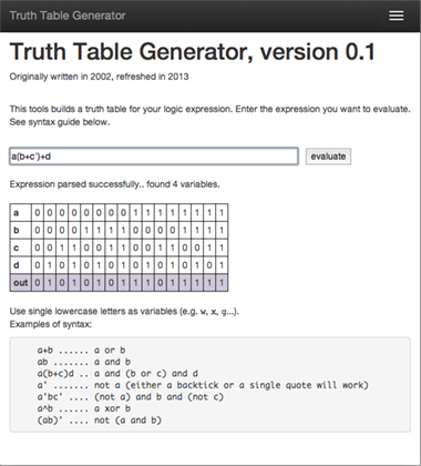
Truth Table Generator is a very simple tool. It allows you to enter a logic expression (using the shorthand notation, i.e. + for OR, nothing for AND, quote or apostrophe for NOT) for which it will show you a truth table, displaying the result of the expression for each of the possible set of values of the variables. It works for up to 26 variables, though it (obviously) gets very slow for 12+ variables – and, anyway, I would say that the value of a truth table is seriously diminished if more than 6 variables are used...


It's all client-side (which makes it fast, and allows it to work offline), which is a common thing these days but in 2002 it was sort of a new thing.

Click through to use the tool.

Click through to use the tool.


References

Software Defects and non-Software Defects

Some years ago I've had the pleasure to work with somebody who didn't know anything about software engineering but was smart and ambitious. He had majored in civil engineering in college and his beginner's (fresh, unspoiled) view on some basic software engineering concepts taught me a lot about the nature of software engineering.

One question in particular gave me some pause. He couldn't understand why developers didn't produce bug-free software. In civil engineering, after all, the results are by and large bug-free, very much unlike software – he argued. Cars don't spontaneously explode; buildings don't collapse, but software crashes all the time.

On one level, it is easy to dismiss his point. Physical stuff is defective, sometimes obviously , sometimes subtly, sometimes dubiously. The defects just look very different.

But come to think about it, there is a difference. The defect rate is certainly higher in software than in the physical world (true for hardware, and definitely true for large physical structures). There are lots of tiny bugs, and some that are incredibly frustrating (for example, bugs that cause your computer to crash and lose that paper you've been working on). We tolerate this higher defect rate because the bugs affect us less than, say, a defective bridge would [1]. Moreover, software isn't bound by laws of physics, chemistry, and material sciences. It's bound by information and complexity theory, but compared to the former, it's a much more lenient power. Those factors help us build faster and more cheaply than we otherwise would, which keeps the software evolving, keeps new products coming, and keeps innovation going. You can't build a good bridge in a weekend, but you could build a good website.

The flip side of software allowing us this freedom is that as we build on top of old software, which is built on top of even older software, the complexity of our solutions increases. A typical product consists of a "stack" that may be 20 or 30 layers of abstraction deep. That's a lot that can go wrong. To make things worse, software interacts with a rich, nonlinear environment. There are relatively few variables to consider as "inputs" to a bridge (for instance, the weight of the objects that cross it) while there are hundreds, if not thousands of "inputs" to an operating system.

But there are also factors which can be mitigated. Maybe we tolerate buggy software to a fault, giving engineering teams the latitude to cut more corners than would be optimal, to ensure a less frustrating user experience. Moreover, software engineering is still rather immature – we've been building bridges for thousands of years, but writing software only for seventy or so.  As we standardize our practices, we will get better at managing the input and environment complexity. Our code will become shorter, smarter and more expressive. Software engineering will continue to borrow from other fields (as it has done, for example, with the lean manufacturing model) [2]. As new paradigms, frameworks and best practices emerge, we should expect software to be less crappy.

While it's easy to think that software engineering as just another process that generates defects, it's helpful to look at it from a broader point of view. Let's not get complacent about software engineering only because it's more complex. Let's use other disciplines to show us how we are deficient, and let's address these deficiencies.


[1] This is usually true, but not always. There have been some very expensive software mistakes in the past. 

[2] Conversely, precisely due to its complexity, software engineering has had to work out a bag of tricks that I think other engineering sciences should adopt. Unit testing or continuous integration come to mind.

Good Design and Empathy

Let me pick on DMV a little, but for a good reason – not just to complain about this much-disliked organization.

I registered my car in the California DMV more than a year ago. Since then I've familiarized myself with HOV lanes and their rules, and, consequently, the Clean Air Vehicle decals. It was learning through osmosis: I kept seeing these diamond shapes on the highway and the signs that informed me of the HOV lane rules. Later, by observing other cars on the road, I've noticed enough of the decals around me to spot a theme and wonder what they are. A quick google search confirmed what I had suspected: if your car satisfies certain requirements, you can purchase a decal, which lets you ride in the HOV lane when normally you wouldn't be allowed to.

I thought it might be good to get one, especially that I knew that my car satisfies the conditions. So I scrolled half way down the DMV webpage that Google found for me and found the link to the fillable PDF, which I downloaded and filled out. The form was mostly intuitive. In a few places I had to refer to my documents. There was a section at the top of Page 2 that I almost missed. And once I printed out the form, I noticed that the PDF software (Preview) messed up a few fields, which I had to correct in black ink. Then I put the form in an envelope, enclosed a check for $8, and mailed it out. Two or three weeks later, I receive my decals in the mail. I haven't put them on my car – the decals are sort of ugly looking, surprisingly large, and you need to literally plaster your car (with three of them, one from each side). So I'm waiting until I need to use one, for example, I'm in a rush and need to use the highway during rush hour. So far, fortunately, that hasn't happened.

Nothing about the above should be shocking to you. I'm sure that you go through a similar workflow multiple times in a week (though – hopefully! – not all of them involve the DMV). It's actually one of the least painful of the DMV workflows.

But from the point of view of good design, it's an awful one.  It highlights the problem that I've noted hundreds of times, a kind of death of a thousand little daggers.  All these suboptimal experiences set a kind of expectation in us; they numb us to the fact that poor user experience surrounds us.

How could this experience be better? I like to think of user experience as layers of an onion, and peel one layer after another, at each level asking a simple question or two: what causes the most pain? What creates the most friction?

In the case of my DMV decal experience, I think the most surface-level pain was filling the PDF out. It took me a long time, but, more painfully, when I finished filling out the PDF, I wasn't confident that the printed out version will contain all my edits. Why not? Try to fill this form out yourself on a Mac.  Some fields (YEAR) replace my value with a 0 on blur. Some fields (UNIT NO) are misaligned. Some fields (top fields on page 2) seem like they are linked to the respective fields on page 1, but the values only show up on focus. Reliability is key, especially when paperwork is required (since the cost of an error is relatively high). So, in this first layer, I'd say that the PDF filling experience could be more reliable and consistent.

That would be great. If that was solved, my next complaint would be the efficiency and complexity of the workflow. Why should I have to print out the PDF, then put it in an envelope, and mail it out? Ironically, the technology for fillable PDFs is significantly more advanced that the technology that makes online forms possible. That would save some trees, and save me and the DMV lots of time (let alone simplify my workflow of having to have an envelope, a stamp, and a nearby mailbox). Even in the most basic form (no error checking) it saves me 5 minutes to do the printing and mailing, and it saves the DMV somewhere between 5 and 20 minutes of bureaucracy. In the second layer, the filing/submission experience could be simpler and more efficient.

With that out of the way, I'd focus on redundancy. Why do I need to enter all my personal info? The DMV has my address on file; if my address hasn't changed (the 98% use case!), I should not have to specify it. Similarly, the DMV has the VIM, the make, and the model of my car. In fact, all I should have to do is enter my unique identifier (I'd love a username that I keep with the DMV, but a physical ID, or name+license number will suffice) and the engine type/whatever the DMV requires to ensure that I qualify for the decal. Hell, even the latter isn't necessary – the DMV has the VIN, the vehicle make, model and year. Again, in 95% of all use cases, the car automatically satisfies the requirements. The input experience could be more minimal.

From here it's not hard to realize that as a user, I should not even have to fill out a form. The DMV knows my registration info, and manages the eligibility rules. So the DMV should automatically – proactively – do the matching and simply send me the decals. They could add the $8 fee to the annual vehicle registration fee. In fact, I should get the decals as soon as I register my car – I shouldn't have to wonder why some cars have decals and what they mean.

Of course, a good user experience designer will automatically see through all these layers. In fact, it's relatively easy to envision the ideal workflow that I described above. But  the point is not that the experience could be better. It should be better, and the fact that it's not points to fundamental gaps in how product and service designers (both the fillable PDF makers and the DMV) perceive users, their context, needs, and experience.

What causes this?  At a proxy level, there are incentive issues (the DMV doesn't feel the acute pressure to make the user experience better), use case complexity (I'm sure the makers of Preview tested their software, but I'm guessing fillable PDFs are very difficult to test exhaustively), responsibility issues (there is probably no single person responsible for the entire decal user workflow; and in many cases, the left hand in the organization is not talking to the right hand). But at the fundamental level, this is an issue of empathy.

Many experienced Product Managers will tell you that empathy differentiates a good PM from a great one. But empathy is a quality that needs to be shared by everyone in an organization, not just select employees. It's like common sense or the ability to communicate. And yet, it's far from prevalent. It's that way because companies don't emphasize it when hiring, they don't value it internally, and they rarely reward it. Worse, empathy is often misunderstood. Empathy is the capacity to recognize emotions felt by other people. It doesn't mean the ability to be compassionate (though it's a prerequisite for the latter). It does not mean being "nice" or "fair". To have empathy means to observe the other (easy), to actually listen to the other (hard), and to suspend one's ego (very, very hard).

There were probably dozens, maybe hundreds, or people involved in the design and implementation of the decal application experience. If just one in ten put themselves in the shoes of the end user (a little bit of empathy), they would invariably see the pain that the end user is feeling. If just one in fifty stopped to think about what would make the experience as painless as possible for the end user (a lot of empathy), I wouldn't have needed to write this post.

What could we, mere users, do to make a difference? The simplest thing each of us can do is expect more. Expect to be delighted. Expect to have a pleasurable experience. Train yourself to identify the pain, no matter how small, and talk about it. Complain, be vocal, fill out reviews, call Customer Service. Make it known that user experience is something you value a lot. Be critical of products and services which are unreliable, inefficient, redundant. Don't tolerate even a single little dagger. Organizations – even the DMV – respond to what their customers value. One voice is not enough, but one voice, multiplied a thousand times, is no longer a voice. It's a roar.

Technology, Venture, and Design

Before embarking on this second incarnation of my blog, I reflected on the past four years of my experiences in an effort to extract a theme closest to my heart. What stood out was an intersection of three areas. I think it's a particularly powerful intersection, one worth taking a deeper look into. These three areas are TechnologyVenture, and Design.

But let's step back a little.

We live in a bimodal age of both specialization and "skilllessness". Some of us specialize – they earn their PhDs, they deepen their understanding of a particular subject matter, they become comfortable in their very narrow and specific job roles. Others go in the opposite direction – they remain "generalists," a term which, more often than not, means having no particular skill but boasting the general ability to deal with people, with maybe an uncommon amount of common sense sprinkled on top. If successful, the former become fantastic individual contributors, and the latter become great managers.

But if we want to aim higher – if we want to change the world in small ways or in big ways, we need to change the way we look at it, and we need to revisit our role in it. We need to know enough about everything to tackle the increasingly complex problems, straggling the increasingly larger number of distinct fields. But we also need to know a lot about enough things to be able to actually make a difference. You may have heard of "T-shaped professionals", having some breadth of knowledge and one area of depth. I want to go one step further, advocating for the need to have deep expertise and experience in more than one area, in addition to the breadth of knowledge elsewhere. At the most basic level, it's because the best insight comes out of understanding several things so well that you can spot the subtlest of connections between them.

There are lots of combinations of areas which can offer such synergy, but I want to focus on three which I think are the most powerful.

- - - 

Technology

Technology truly is the driver of mankind's progress. Technology – literally the act of applying our knowledge – has a transformative ability. An insanely powerful flavor of technology that emerged in the twentieth century – software – is the best testament of that. Software frees us from most physical constraints. You can stack software on top of other software, which lets us create remarkable leverage. Fluency in technology – and software, specifically – is indispensable in the twenty-first century.

Many of the people I interact with hope that a superficial understanding of technology will do. After all, they can outsource the technical work. Well, as many firsthand experiences have taught me, there is absolutely nothing worse than having someone who does not understand technology attempt to manage, or in some meaningful way contribute to a problem that requires technology. Those people are like that broken wheel in the grocery cart – yes, it supports the cart, but it's really not that much more difficult with just three wheels, and boy is that broken wheel frustrating! You have to stop all the time, adjust the wheel and hope that it will continue moving in the right direction.

Here in business school, some of my classmates hope that they can just take an intro CS class and check the technical box. While they will no doubt do very well in that class, I'm afraid it's not enough. The flip side of that ability of technology to provide massive leverage is that to understand (let alone to harness) technology means to have to dig very deep, layer beneath layer, to achieve proficiency. You not only have to be able to write a Hello World! application; you have to understand what makes the computer print Hello World. It's a deep stack to understand, and for that, you also need to have a good command of mathematics. One CS class just won't cut it. It's about a mindset, a way of seeing the world.

I was fortunate to be exposed to leverage-providing technology very early in my life, thanks to my father who foresaw the rise of software and smuggled a computer into the country for me to play with. For those who believe in the importance of technology, but who don't have the background, the best advice I can give is to unconditionally immerse oneself in it. Set a goal – to write a photo-sharing app, or something – and be relentless in getting to that goal. At first, you won't even know what questions to ask. Struggle! Get help, google incessantly, learn by failing a hundred times which stackoverflow comment is useful and which one is useless.

 - - -

Venture

The desire to build a business, or a deep understanding of what makes businesses successful and unsuccessful, is an ability that I only learned to appreciate relatively late in life.

Business is the ultimate applied science. The best way to test an idea is to build some life support around it and open it up to the world, to see if it can survive. You may have arrived upon the best theoretical result, but to change the world, you should turn your theory into a sustainable business. Being venture-minded is also a great way to ensure that you don't solve problems that nobody has, and that you don't just create a science fair project. Subject your ideas to the harshness of reality. If they blossom, you have come up with something of great value.

The best way to acquire a business intuition is to be in business. You have to have enough exposure to what makes a business tick. I spent six years at a company, but – while the management was wonderfully transparent, allowing me to learn what a company should and should not do – I barely saw the tip of the iceberg. That's why I recommend joining a company small enough so that you can understand fully what it does and why it does what it does.

You can also start a venture. The learning curve is steepest, and the things you learn you will never forget; but you will be subjected to the ebbs and flows of luck.

If you haven't had much experience with business, you can try business school. That's what I chose – and I'm glad I did. By immersing myself in a rich ecosystem focused on business issues, I've acquired an intuition I haven't had before. I think about the world differently now. But all the theory, the cases, the conversations are just one part of the equation. You have to go out and apply what you learned. 

 - - -

Design

Design, or rather, the art of human experience, is another area that I consider essential. You may have the best technology, and the best business model, but to be truly successful, you have to understand how your product or service integrates with humans, their workflows, their pains, needs and desires.

You can't change the world if you don't interact with humans, be it a product that you design that people want to use (Tesla is changing the world – it's doing so by creating products that people love), or an institution you establish (which consists of a number of human beings), or even a book you write (which is read by humans).

Many of my friends think of design – or the experience that humans have with their creations – as secondary. I think that's what differentiates good solutions from great solutions. You can't outsource design: if you think you can, you betray the critical fact that you don't understand your product and your customer enough.

 - - -

Understanding technology, being venture-minded, and caring about design and the human experience are incredibly powerful. In the next few decades, as software continues to eat the world, as technology roles remain the most lucrative, and as techniques such as analytics and hypothesis-driven experimentation push their way into most job descriptions; as consumers and businesses alike continue to demand human-centric products and services that understand user needs and reduce frictions to use; and as more ideas start seeing the light of day in the form of viable businesses, these three areas will seem just as indispensable as the ability to communicate or to use a computer is now.

Better be on the forefront than try to catch up when it's too late.

Crowdsourced Art

I had this idea to get my friends together to create art. I created a simple tool which allowed them to draw on a small canvas. I gave them a small number of pixels each, but they could cooperate (and earn bonus pixels) or overwrite others' work.

I ran a small iteration of this project back in 2009 with my friends. People had fun so I decided to add a few new features. Currently, the tool has an ability to "mine" tokens directly on the page - with enough patience, you can earn free pixels just by staying on the page. I'm also trying to make it a little easier to draw and explore what others have done.

I hope to be done in a couple of weeks, at which point I'll give all my classmates a chance to contribute with a relatively large number of pixels each. In the meantime, you can play with the test run, by mining the pixels (you can also email me to get a token). The canvas so far is shown below. Click through to contribute!


This is the canvas of the current crowdsourcing art experiment.

To get all the details, you can read about this project here.

By the way, in the 2009 iteration, my friends came up with this:


This is the result of the 2009 iteration of the project.

Disappearing Messages

(Idea originally conceived in 2009)

I’m fascinated by color. When I was younger I dreamt of discovering a color that nobody has ever seen before. And since most computer languages give you easy ways to manipulate graphics, I played with color on a computer.

One day I saw an interesting effect on some certificate I received. When I photocopied it in black and white, a word appeared in the photocopy ("COPY") that wasn’t visible in the original. This "security measure" took advantage of the photocopier’s inability to faithfully replicate the document (the word COPY was actually visible in the original but it was difficult to see because it consisted of a myriad of tiny dots). I wondered whether it would be possible to hide messages in documents even if the copier were to produce faithful facsimiles, but converted color to black & white images.

Introducing Disappearing Messages. If you're interested in the theory behind this effect, see this post and this post.

In this first experiment, text is visible in a color image, but when you render the image in black & white, the text will disappear.

Text to make disappear:

In the second experiment, text is only visible once you render the image in black & white. I've added a "distraction" text that you will see in the color rendering. (On your computer screen, you may still see both strings because of your browser's image color correction or color variability of your LCD screen. But if you print the image out in color, you will only see the "distraction" text.)

Text to make disappear:
Distraction text:

A New Color Picker

(Originally published in 2010)

I bet you've seen color pickers before. They are neat UI elements that allow you to select a particular color that you may have in mind. They do that by organizing the entire color space in a way that's easily browsed. Usually, pickers show you a 2D panel that displays all colors along two of the dimensions, and a slider for the third dimension; or they only show you a small-ish subset of all the colors.

I’m fascinated with color, especially when there’s math or technology involved. And so I set out to build a picker that displays all the colors, yet requires only a single two-dimensional surface.

To learn all the details of how I generated this new color picker, see this post. In short, however, the idea is this: we want to map a 3D space (0..255, 0..255, 0..255) into a 2D space (0..4095, 0..4095) in a smooth way, so we'll use space-filling curves. "Walking" the R, G and B dimensions, however, gives a pretty unsmooth picker, so instead I "walked" the color intensity, and for each intensity, "walked" over all possible colors of that intensity. I then picked the order in which the colors would appear by sorting by R, G and then B.

The resulting color picker has the interesting property that it displays all possible colors (up to the image's resolution) in a single image:

A New Color Picker

A New Color Picker

A Homebrew Computer Alarm

(Originally published on January 7th, 2010)

I wanted to wake up to NPR. There’s a good alarm application for the Mac called Alarm Clock which allowed me to play an arbitrary iTunes playlist on schedule (with bells and whistles such as gradually increasing the volume), but the free version couldn’t deal with playing audio streams (such as, in my case, wnyc.org).

No problem — I used cron as well as OS X’s built-in wake-on-schedule functionality.

First, in System Preferences > Energy Saver, I set a schedule to wake up the computer on weekdays at 6am. Then I edited the crontab: in Terminal I typed

crontab -e

and typed in the editor

1 6 * * 1-5 osascript /Users/strozek/wnyc.applescript

The above tells OS X to run the command osascript at 6:01am Monday through Friday. The script I pass to osascript is the following script:

set volume 2
tell application “Safari”
activate
open location “http://wnyc.org/flashplayer/player.html#/playStream/fm939″
end tell
delay 20
set volume 2
delay 20
set volume 2.75
delay 20
set volume 3.25
delay 20
set volume 3.75
delay 20
set volume 4.25
delay 20
set volume 5

And voilà! I just need to remember to keep the computer plugged in at night and not close the lid.

The Zoom Effect

(Originally published on October 19th, 2009)

Before using Squarespace, I built my own front page. As I considered the best way to display series of pictures there, I came up with an interesting way to compress a lot of information onto fairly limited screen real estate. The idea was to have a kind of a slide show composed of small icons that turn larger as you hover over them; clicking on any icon would bring up with full-size image. That way I could fit a lot of small (32×32 pixels) icons of images on the screen, yet offer the users the ability to browse larger versions (67×67 pixels) easily just by moving the mouse around. The idea, of course, was inspired by what OS X does with the Dock (an effect which, sadly, I have disabled on my computer–but due to different use scenarios). Here is the effect in action (roll your mouse over the images):


The design process I went through is an interesting example of discovery (or serendipity, rather) and how taking an analytical approach doesn’t always yield the best results.

The desired effect will be very familiar to you if you’ve used OS X and the Dock. I want to display a series of small thumbnails of images in a row. If you hover over them, the image that your mouse is closest to gets larger, pushing out the other images if necessary. I wanted the effect to be smooth (so as you move your mouse over the row, images get bigger as they approach the mouse pointer, and then get smaller) and resemble something like this:

The Zoom Effect

The Zoom Effect

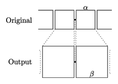
There are three variables that I need to be concerned about: how much to magnify the icons by (in my case, I wanted to go from 32 pixels to a maximum of 67 pixels), how far out the magnification should affect the icons (in the picture above, the icons two to the right of the center icon are no longer magnified), and how quickly the magnification should drop out (how “drastic” the magnification of the center icon should appear). For each of the icons in the row, I need to figure out how much to magnify them (by convention, let’s say that 1 is full magnification and α is the regular, small size) and where to place them horizontally (because they will push out other icons), subject to the constraint that the icons must remained aligned in a row.

An analytical solution was easy to get to, but very quickly spiraled out of control, and here is how. Let’s consider two configurations:

  • When the mouse cursor is exactly in the center of an icon, by symmetry that icon should have the maximum magnification:

Maximum magnification at center of icon

Maximum magnification at center of icon

  • When the mouse cursor is exactly in between two icons, also by symmetry both icons should be of equal size:

Equal magnification in between two icons

Equal magnification in between two icons

 Depending on β, the magnification will drop out quickly (if β is close to α) or slowly (if it’s close to 1).

Since we want the magnification of the icon to be a smooth curve (as the mouse pointer moves across the icons), we simply need to define a continuous function given the three points it goes through: (0, 1) (because atx=0 — i.e. when the mouse cursor is exactly over the icon’s center, we want the magnification to be maximum), (α/2, β) (because when we’re in between two icons — i.e. a distance α/2 away from the center of one — we want the magnification to be β) and (Z, α) (the distance at which all magnification ceases). An exponential curve is the simplest one that we can try:

Magnification as a function of distance from the icon's center

Magnification as a function of distance from the icon's center

 We will then be able to use this curve to determine how much to magnify each icon by. The icons will be sized such that their size given the distance between their center and the mouse pointer can be read off of that magnification curve:

Applying the magnification curve to each icon. Past the point Z all icons retain their original, small size

Applying the magnification curve to each icon. Past the point Z all icons retain their original, small size


First let’s figure out the full form of the magnification curve. The curve must go through the two endpoints we identified, and be exponentially decaying, so it is of the form

\[y = 1 - \left(\frac\right)^P\cdot(1-α)\]

(We can verify that at 0, y=1 and at Zy=α). We need to compute P based on the third point:

\[β = 1 – \left(\frac\right)^P\cdot(1-α) \Rightarrow P = \text\right)\]

The first icon is simple: determine the distance between the mouse pointer and the center of the icon and use the curve above to read off the magnification (it will be something between β and 1). The subsequent icons are a little more tricky, because in order to figure out the magnification you have to know how far its center is from the mouse pointer, but the position of the center is a function of magnification! At this point the easiest thing to do is to solve this numerically, by simply iterating over all possible positions of the center and determining the closest one (since we’re operating in a discrete space with the smallest effective resolution of 1 pixel).

While each step seems fairly straightforward, the end result is a pretty big hairball. Being lazy, I realized that there must be a better solution to this problem.

And then I realized that so long as the illusion of smoothness is preserved, some simplifying assumptions can be made. First of all, the exponential curve I used initially was too complicated and looked too discontinuous at large magnifications (because of a sharp spike near 0); there must have been something else that’s straightforward to compute. The parameters seemed complicated, too — α and Z could be replaced with just one — a measure of how quickly the magnification should decay — without much loss of the effect.

The Normal curve came to mind — with just one parameter (σ) it was much easier to experimentally determine a value that had a pleasing effect (plus, σ is by definition very close to our notion of “how quickly this should decay”). I also got rid of the self-referential problem (determining magnification requires knowing origin, but origin influences magnification) by looking at not the actual distance (how far is the icon from the mouse pointer after all icons have been magnified), but original distance (how far is the icon from the pointer before magnification).

The resulting algorithm is much more elegant — and produces a more visually pleasing effect:

  • For each icon in the original (i.e. before any magnification takes place) series, determine how far its center is from the mouse pointer (I experimented with just using the x-coordinate, but the nice thing about this algorithm is that any smooth function works, and the actual distance produced a nicer effect than just the horizontal distance)

  • Use the Normal curve to determine its magnification. We want the result to be 1 if the distance is 0 (i.e. the icon is directly under the mouse pointer) and α if the distance is infinite (since the Normal curve dies off quickly, the size would go down to α pretty quickly as well), i.e.

\[N = e^\]

\[M = N+α(1-N)\]

  • Place each icon with its magnified size on screen; keep track of how much space each icon took so that subsequent icons can be displayed after it and not on top of it

  • Technically this is enough for magnification. However, this doesn’t produce a smooth effect: since the icons are always pushed out to the right, the “tail” of icons keeps traveling back and forth. We want the entire series of move smoothly, slowly to the left as the mouse moves to the right (go here and watch the icons at the end of the series travel to the left as you move your mouse pointer left to right, across the icons). This is simple to correct, though: keep track of how much space all the icons take (by adding up each size as you go), and then offset all the icons by a fraction of that total space, depending on where the mouse pointer is: suppose the icons originally take d pixels, and expanded they all take D pixels, and the mouse pointer is at position x (between 0–at the beginning of the series–and d), we want to offset all icons by

\[x\cdot\frac\]

See also