Playing with Color (part II)
(Originally published on June 20, 2009)
Last time we took an image that displayed a message which would disappear when the image was rendered in grayscale. A much more interesting problem is the opposite one — can we embed a message an in image so that it appears when the image is rendered in grayscale?
It’s not as easy as the first problem — there we had information theory on our side (the conversion to grayscale destroys information as three components — red, green and blue — get converted to just one — intensity). Now we have to get a little more creative (again, you should be able to improve on my proposed algorithm).
Instead of using information theory, we’re going to use psychology: we’re going to trick the brain.
The idea is pretty simple, but it requires us to think in the HSL space: instead of thinking of color as a composite of three primary colors, think of a color as a composite of three properties: its hue (“where on the rainbow the color is”), its saturation (“how vivid the color is”) and its lightness (“how close is the color to white”). Lightness is not quite the same as intensity (because hue and saturation are nonlinear in the red, green and blue components). It turns out that our brain decomposes the colors into their HSL components better than their RGB components (which one of the two colors has a higher R component, black or green?). The idea is to encode the message with a color of a lower intensity that compensates for it by having an unusually high lightness.
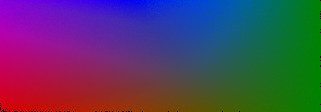
First, we’ll define a scratchpad — a two-dimensional set of all possible colors of a given intensity I (I used I=0.3 experimentally). The color space is three-dimensional, but if we add one constraint (intensity has to be equal to I) we can map the resulting colors onto a two-dimensional space. We will use the x-coordinate to determine the intensity of the green component and the y-coordinate — of the red component. We would like the pixel color to be uniquely identified by these two values. This is often possible, but if the green and red intensities are outside of certain bounds such a color won’t be possible (for example, consider a pixel whose green and red components are both 0.5 — if you want the pixel to have an intensity of 0.3, the blue component would have to be equal to -1.25).
Hence, we’ll transform the x and y coordinates so that the resulting image is rectangular — that is, for each row, x=0 will map to the smallest value of the green component that makes a color possible, and x=max will map to the largest value of the green components that makes a color possible.
If we didn’t transform the coordinates, the resulting scratchpad would look like this — note the areas that make it impossible to construct a color:

All possible colors of intensity 0.3
Now transform the coordinates (this gets rid of the empty space and expands the rest). Click to cycle through the scratchpad, its lightness map, and its intensity map (the latter should be all homogenous color, equal to I)

We’ll take advantage of two properties of such a scratchpad: every pixel has the same intensity; and pixels that are close are of similar colors (since the mapping is continuous in the red — as we move up and down the scratchpad — green — as we move left to right — and blue space — because blue is derived from the intensity formula, which is linear).
Now go through the scratchpad and find pixels that have unusually high lightness values and make them darker. By changing the lightness we’ll be changing the intensity of the pixel but because these pixels have high lightness our brain won’t be able to determine the difference in intensities. I use a scaling function with a gamma correction:
if(lightness>I)
  lightness = ( ( (lightness-I)/0.35 )^0.8 )*0.2 + I
end
Click on the image to cycle through the scratchpad, its lightness map and its intensity map (this time the latter should have a darker area):
Now, if you look at the resulting image, you will see that a number of pixels have an intensity different from I but they still look pretty bright (because their lightness is high). We’ll pick either the dark or the bright pixels based on whether we’re encoding the message or the background. We limit the colors we pick to a subset of the scratchpad that features pixel ranges with the highest changes in intensities (that way we can “smuggle” a low-intensity pixel in around similar pixels of a higher intensity).

Secret message embedded using pixels of lower intensity but unusually high lightness
We can stop here — transform the input image the same way we did it last time, by decreasing the variance between white and black and pick a color from the scratchpad that matches the intensity. But this is not good enough (our brain is, after all, smart). Let’s introduce a distraction message that appears faintly in the color version of the image but disappears in the grayscale version (we already know how to do that!). Based on the intensity of the respective pixel in the distraction image we’ll alter the color we picked from the scratchpad without altering its intensity (so as to cause no difference in the grayscale image).

Added a distraction image
We’re done — we’ve successfully tricked our brain (provided that we pick a smart distraction message).
Note that on your computer, you will still be able to see the message in the image above, for two reasons.
Depending on which browser (!) you’re running, your browser may embed color profiles in images to compensate for differences that various computer screens render colors. This, of course, screws our mathematics up somewhat.
- If you’re viewing this on an LCD screen (and, let’s face it, you are), you will be able to change the angle from which you look at the screen to reveal the hidden message.
- If we print the image out, however, we’ll see the full effect. To fix it so that the message disappears on a computer screen as well, we can simply apply the inverse color profile transformation, or define the region of the scratchpad that we pick pixels from differently.
Demo!
You can see a demo of this effect here
See also
Check out References for some useful color-related references, including a note on color space conversions.
Check the code out on github.